Overview
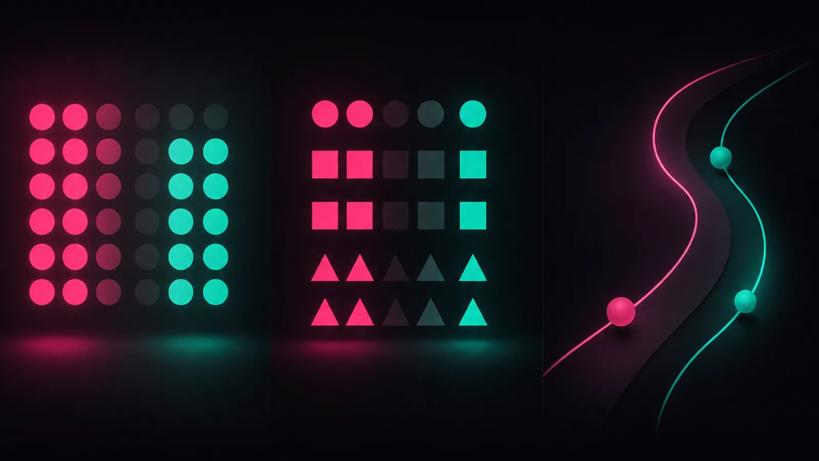
The Gestalt (German for shape or figure) principles of visual perception were created by a group of German psychologists, including Carl Stumpf, in the early 20th century to explain how human visual perception works. They explain that we are predisposed to perceive whole shapes, figures, and objects, not disconnected edges, lines, and areas.
As a design leader who oversees designers, I often look for ways to help my team improve their work. I often need to explain to my product management and engineering colleagues why the design team advocates for a specific direction over another. These principles, when properly understood, do just that. They inform our design practice at a fundamental level.
Proximity
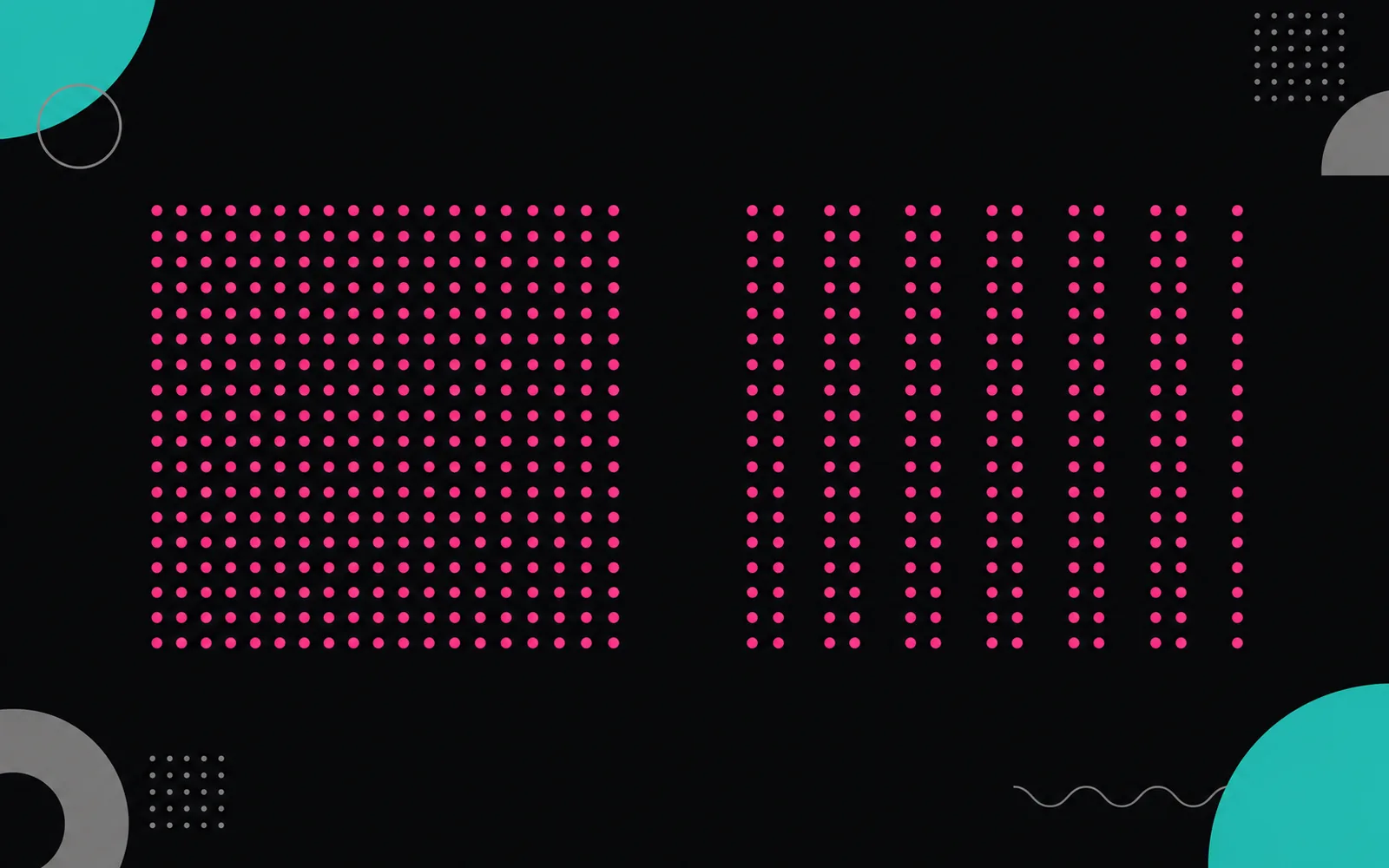
The proximity principle has to do with the distance between two objects. It demonstrates how display affects our perception of how things are related to one another. Objects close to each other seem like they are part of a group. Objects far away from each other do not seem to have a relationship.
This fact has obvious applications in UI and UX design. When you group related controls together, it helps users figure out how they interact with each other. That is why designers often place similar items in a box or separate different ones with a line. One example that comes to mind is the button groups Apple's Human Interface Guidelines for watchOS share. They recommend aligning similar items on the same horizontal or vertical line, and watchOS uses the proximity principle by grouping the call and message buttons.
Similarity
One of the key takeaways from the Gestalt principles is that the human brain strives to simplify complexity and make sense of the world. If you recall my article on how empathy maps are a useful tool to overcome cognitive bias, you will remember that confirmation bias arises from the same human tendency to simplify life's complexity. The genius of these principles, and something you can take advantage of to improve your design understanding, is seeing the impact that our need to order the world has on visual perception.
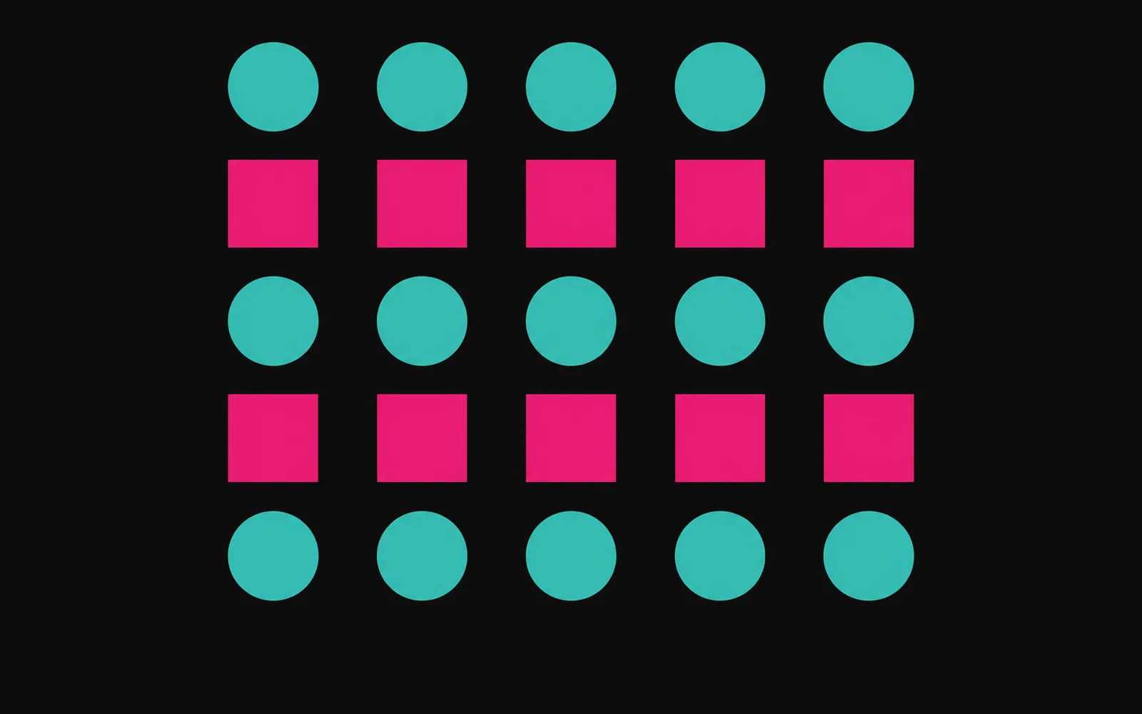
Similarity means people will perceive that items belong together if they look the same. In Apple's Human Interface Guidelines, one can find similarity at several levels. For instance, the iPhone and the iPad share a common design from an industrial perspective: button and camera location, power switch design, and hundreds of other details. While the operating systems for the iPhone and iPad are not identical, they share numerous design elements from a software design perspective. This causes us to perceive that the iPhone and iPad belong to the same group.
Continuity
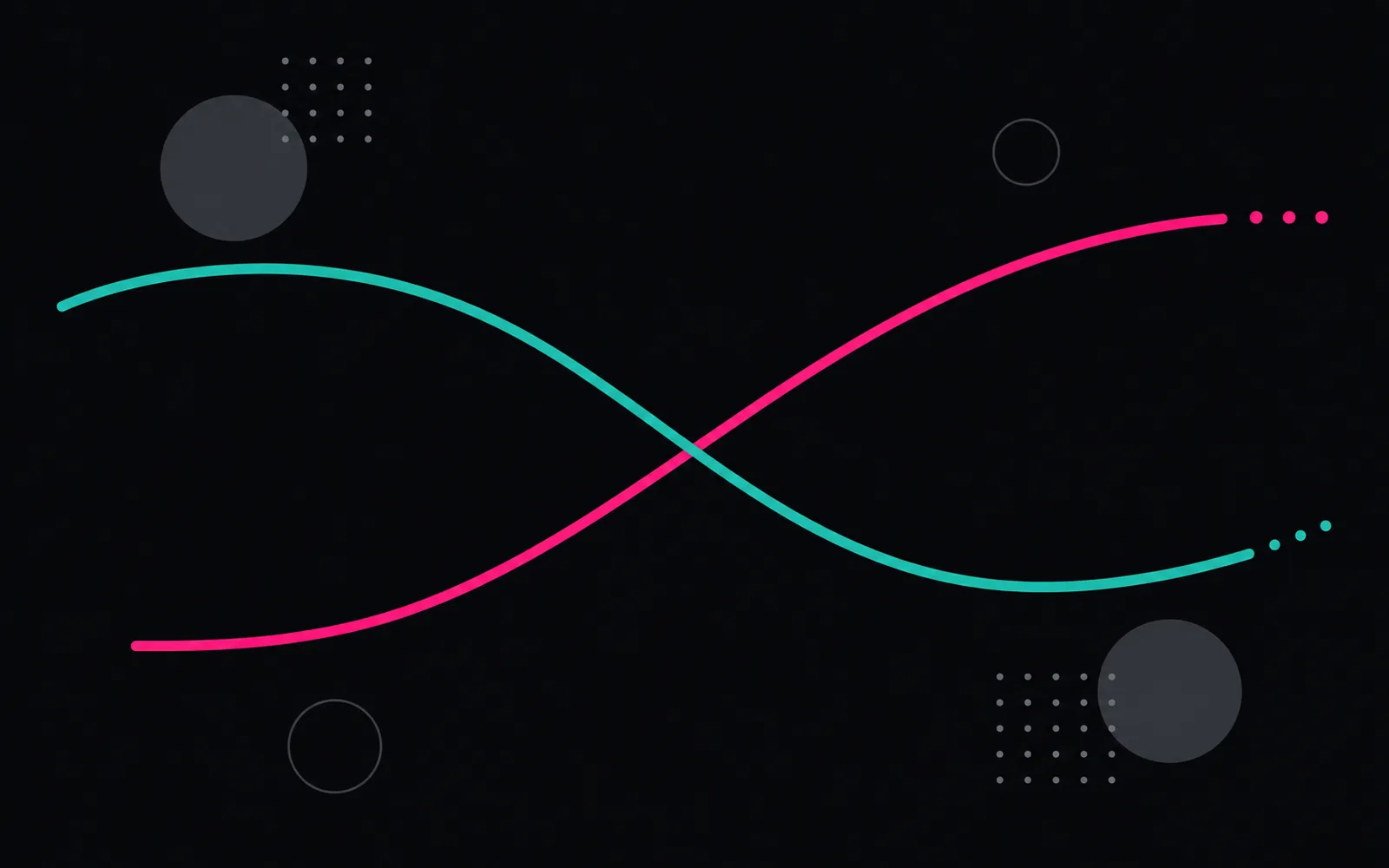
Our visual perception system resolves ambiguity and fills in missing data to create whole objects. We are hard-wired to favor continuous forms rather than disconnected segments. Our brains will fill in missing information if needed. Enter the principle of continuity.
In a scrolling interface, we understand that the user interface continues below the so-called fold of the page. We know that the remainder of the screen will come into view if we scroll. In tvOS, Apple purposefully places elements partially offscreen, taking advantage of the continuity principle to allude to offscreen elements. The IBM logo works the same way: using the continuity principle, we connect its horizontal stripes to form the letters I, B and M.
Conclusion
In his 1923 paper Gestalt Laws of Perceptual Organization, Max Wertheimer is credited with formalizing these tenets. In addition to the three I have discussed, proximity, similarity, and continuity, there are four more. I will discuss closure, symmetry, figure and ground, and common fate in part two.