
Overview
The Gestalt (German for shape or figure) principles of visual perception were created by a group of German psychologists, including Carl Stumpf, in the early 20th century to explain how human visual perception works. They explain that we perceive whole shapes, figures, and objects, not disconnected edges, lines, and areas.
In part one, I explained how the proximity, similarity, and continuity principles guide my UX and UI work, with examples from Apple's Human Interface Guidelines. This article covers the other four: closure, symmetry, figure and ground, and common fate.
Closure
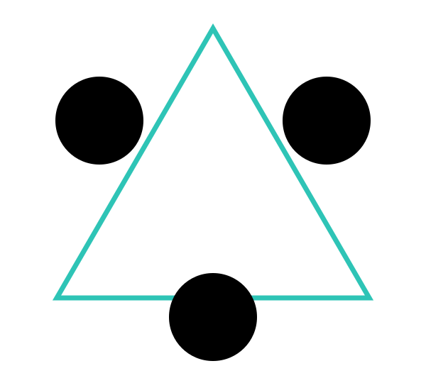
The closure principle states that the human visual perception system attempts to close open figures automatically. This tendency means we perceive whole objects even when we see separate pieces. Open lines appear closed. In the Kanizsa triangle, a classic demonstration of closure, we perceive a complete circle and make out a triangle in the middle even though no lines draw its sides. All that genuinely exists are three V shapes and three Pac-Man-like discs, yet our eyes cannot help but see a white triangle that is not there.
The World Wildlife Fund's panda logo, created by the San Francisco office of Landor, also uses the closure principle. Our eye connects the incomplete black shapes of the torso and the head to complete the panda, and the mark has represented the conservation movement for decades.
Symmetry
Our visual system also tries to reduce complexity. That means we choose to see simple symmetry in objects. When there are multiple ways to perceive a display, the human visual system prefers to see simple, symmetrical things rather than more complex and asymmetrical ones. One can see this phenomenon in the example below.
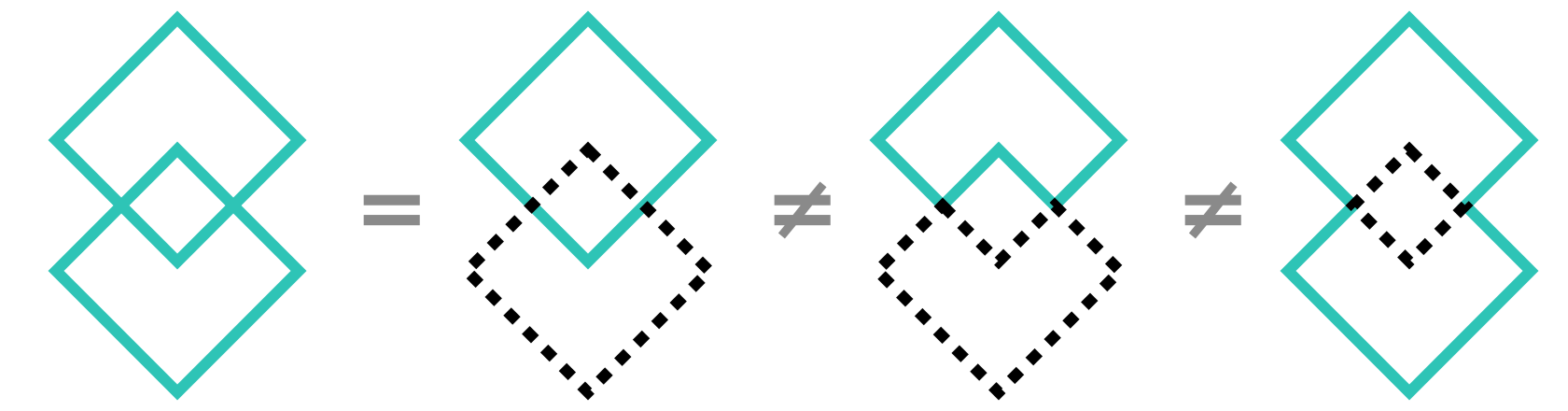
Figure and ground
The figure and ground principle states that we are predisposed to see objects within a relationship of primary and secondary importance. The figure, or foreground, is more important than the elements that sit behind it in the background. It also explains how the characteristics of objects can determine our perception of foreground and background. For example, when small things overlap a larger one, we view them in the foreground.
In interface design, this takes the form of modal windows and dialogs. An element formerly of secondary importance is temporarily allowed to become of primary importance in the foreground. This approach lets users remain oriented, because the previous foreground is still visible. As specified in Google's Material Design system, a dialog takes advantage of the figure and ground principle by coming to the foreground when the user needs to make a decision.

Common fate
The only Gestalt principle that deals with movement is common fate. This principle says that we perceive objects that move together to be similar and related. Menu systems like the ones in Google's Material Design use the common fate principle. Different levels of the menu open out in a similar cascading manner as the user interacts with it, and the user understands that these elements are related. When different levels of a hierarchical menu cascade outwards and downwards in the same way, common fate explains why we perceive them as a group.
The expansion panel in Material Design is another example of common fate. Here the user groups the panels together because of their shared opening and closing movement to reveal additional information.

Conclusion
I hope you enjoyed this article on the Gestalt principles. I use these laws constantly in my work designing interfaces. As with all things, when we are conscious of the tenets behind our work, we can better take advantage of them and use them to our benefit. Ignoring them leads to unintended relationships among the objects in your design; a clear awareness of them will minimize errors and ensure success.