The problem
A meditation app sells calm, so its sign-up flow has to practice what the product preaches. If answering a form feels like intake paperwork, the promise is already broken before the first session starts, and that's before the app has asked for anything it actually needs: a person's goals, their stress level, when they actually have five free minutes.
I wanted to personalize a practice from the first screen, but I didn't want to guess which visual language would make someone willing to answer those questions. So I designed two answers to the same problem and let a controlled comparison choose between them instead of my own opinion.
Research
The comparison itself is the research instrument. Instead of interviewing a handful of people and picking a direction, I built the same five personalization questions twice: once inside a photography-heavy desktop flow, once inside a minimal twelve-step mobile flow, so the two designs compete on completion instead of on my preference for one over the other.
- Parallel prototyping: the same goals, preferences, and plan questions, built twice in two different visual languages, so neither wins by opinion.
- Fictional-data discipline: every dashboard number in the live prototype carries a demo-content label, so no invented streak or stress trend can pass for a real one.
- Planned validation: the first real gate is six wellness seekers completing onboarding unaided, not a bigger demo.
Design decisions
Seven short concept films: a life in greyscale igniting into colour the moment practice begins.
The chef
The executive
The couple
The writer
The runner
The commuter
The walk
Four social spots pick up where the films end: the same characters in full colour, saying what changed. Tap a card for sound.
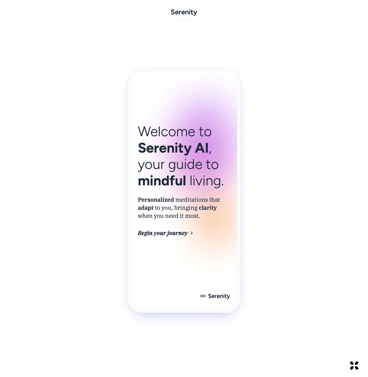
Discovery and daily practice are different jobs, so I gave them different visual temperatures. The desktop flow uses full-width lifestyle photography and multi-question screens to build excitement before someone has committed to anything. The mobile app drops the photography entirely: one question per screen, an abstract gradient standing in for imagery, because a private, meditative moment needs a calmer surface than a landing page does.
The sequencing inside each flow was its own decision. Onboarding runs five steps: goals, preferences, plan, gift, start. The starter-kit reveal sits at step four, after a person already has an AI-generated plan in hand and before the subscription screen.
Comparison
Two flows, one set of questions
A neumorphic desktop flow and a twelve-step mobile flow ask the same five personalization questions, built to compete on completion rather than settled by opinion.
Sequencing
The gift before the paywall
The starter kit reveal sits at step four of five, after a person has a plan in hand and before the subscription screen asks for payment.
Sound
Ambient audio as interaction, not decoration
Guide voice and ambient audio are generated per answer and matched to the session plan, so sound is part of the personalization logic, not a soundtrack added afterward.
Labeling
A demo-content label on every figure
Every streak, insight, and dashboard figure in the live prototype carries a demo-content label, plainly marked as such.
Payment is the fifth thing I ask for, not the first.
The desktop flow
Five steps toward a plan, then a dashboard that keeps tracking the starter kit after checkout.
The mobile flow
One question per screen, in gradients that shift with the question rather than a single house color.
Design system
| Aspect | Web onboarding | Mobile app |
|---|---|---|
| Visual style | Photography-heavy, realistic | Abstract gradients, minimalist |
| Colour | Warm oranges for urgency and action | Pastel blends for tranquillity |
| Interaction | Several questions per screen | One question per screen |
| Imagery | Lifestyle photos of diverse people | Iconography only, no photos |
The mobile app's neumorphic system makes the argument most clearly: soft gradients standing in for photography, rounded surfaces instead of hard edges, and a single question sitting alone on an otherwise empty screen. Nothing there is decorative. The palette shifts hue with the question (teal for motivation, amber for experience, warm pink for duration, violet for timing), so a returning user can recognize which question they're on before reading a word.
- Progressive disclosure: information revealed gradually, so onboarding never asks for more than one decision at a time.
- Emotional resonance: each screen connects to a specific feeling, calm, hope, or transformation, rather than a generic form field.
- Tangible value: the physical starter kit makes an intangible benefit like stress reduction something a person can hold.
- Choice architecture: default selections guide people toward the paths the plan is built to support.
- Friction reduction: skip options, back buttons, and flexible plans keep one hard question from ending a session.
Where it stands
Both flows exist as real, tappable prototypes today, on their own domains, running the comparison they were built for.
The comparison
Same product, two temperatures
Same five questions, two devices, two visual languages, running side by side rather than settled by my own preference.
The session
A complete loop, start to finish
An AI-generated plan, a guide voice, ambient audio matched to that plan, and insights that update as a practice continues.
What I learned
Building two flows instead of one was the more expensive choice going in, and it stayed that way. It's also the only way I know to resolve a real design disagreement without just picking whichever version I personally prefer.
The harder discipline
Fictional data, labeled as such
A streak that looked real would have made this case study read better, and would have been a lie.
The plan
Nothing changes because there are two
Building two options doesn't change the plan going forward.
The rule
Whichever flow loses gets archived
Whichever flow real users don't finish gets archived, not kept alive as a second surface to maintain.