The problem
InstructLab lets people improve a large language model by contributing structured knowledge and skills, no ML engineering required, at least in theory. Every contribution lives inside a deep taxonomy tree, and that hierarchy is what makes the platform scalable. It's also where usability broke down: a contributor had to understand and navigate a multi-level category system just to find where their knowledge belonged, before they could contribute anything at all.
For a tool built to invite broad participation, taxonomy navigation was the first wall most people hit, and the people hitting it were domain experts, not developers. I took on a self-directed redesign of the contributor-facing interface: how people navigate the taxonomy, submit examples, and understand what the model has and hasn't learned.
Research
I grounded the redesign in three personas built from InstructLab's real target audience. Jordan Ellis, a customer success manager who wants to teach an AI the product knowledge in her head. David Kumar, a bank VP of finance who won't write code but needs airtight compliance and audit trails. Patricia Williams, a senior HR manager training an AI assistant to help thirty-five managers navigate performance reviews after a merger, the persona I used to stress-test the interface end to end.
- Persona construction: three domain-expert profiles standing in for InstructLab's actual contributor base, not its engineering audience.
- Journey mapping: Patricia's rollout across six phases, from uploading anonymized review examples to piloting with three managers to rolling out to all thirty-five.
- Trust-signal auditing: black-box processing states, vague error messages, and silence during training all read as risk to someone accountable for legally sensitive guidance.
Design decisions


A concept redesign of an open-source project, not affiliated with IBM or Red Hat.
Patricia's journey map turned directly into interface decisions. Her anxiety during model training became step-labeled progress states, analyzing examples, extracting patterns, configuring guardrails, instead of a bare spinner. Her fear of missing a legal risk became a guardrail-review screen that proactively surfaces protected categories and lets her add her own rules, like blocking the AI from ever suggesting termination language, a decision that belongs to HR alone. Her worry about opaque judgment became visible confidence signals on generated responses, so she can see when the model is uncertain rather than confidently wrong.
Navigation
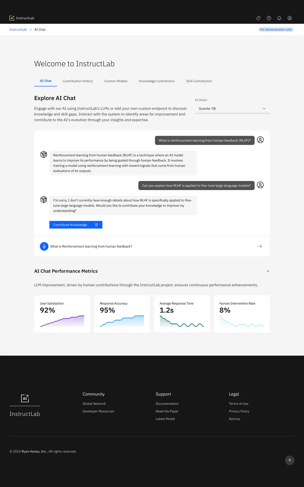
Miller Columns instead of nested menus
A three-column picker shows category, subcategory, and topic side by side, so a contributor sees the full path while drilling down instead of losing context in a tree.
Modes
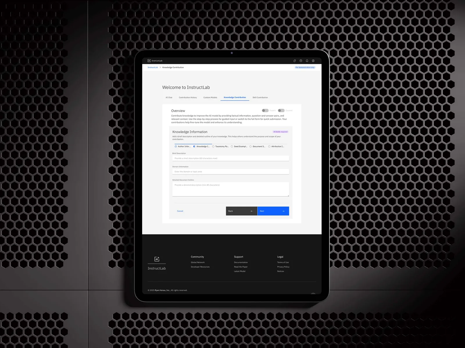
Beginner and Expert, not one form for everyone
A step-by-step wizard with progress indicators for first-time contributors, and a single-page, all-fields view for repeat contributors who need speed without losing the audit trail.
Foundation
Carbon Design System, not a new visual language
Building on IBM's own Carbon components keeps the concept consistent with the platform's existing ecosystem and credible as a plausible evolution of the real product.
Prototyping
Straight to code, not static comps
I used Vercel v0 to generate production-quality React and Tailwind components from prompts, so the concept could be evaluated as working software rather than pictures of software.
A taxonomy that doesn't require a map, a workflow that flexes between guided and expert use, and an interface that shows its reasoning to people whose job is to catch the moment it's wrong.
The final interface
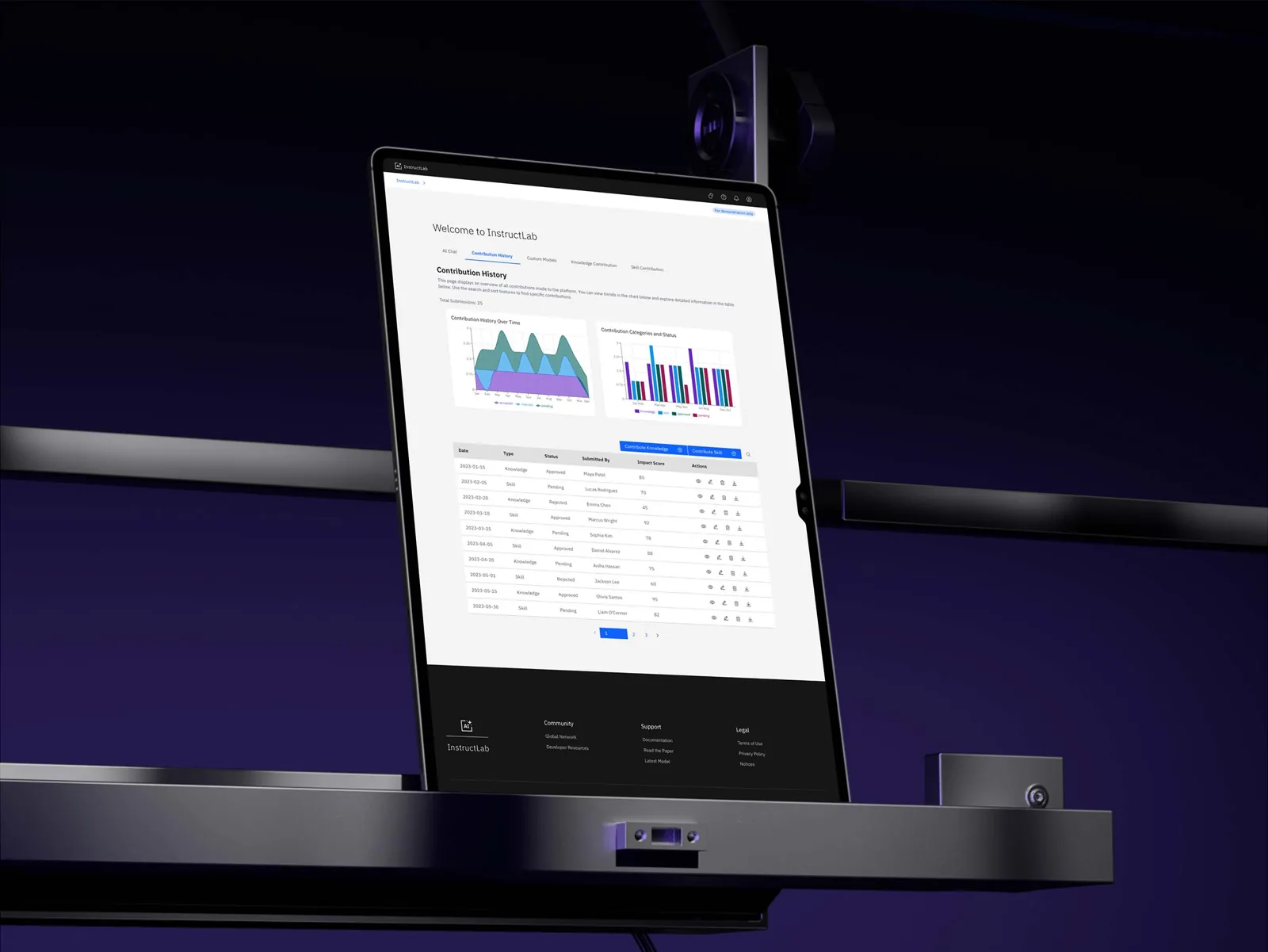
Nine screens in the working prototype; these seven carry the argument.
On device
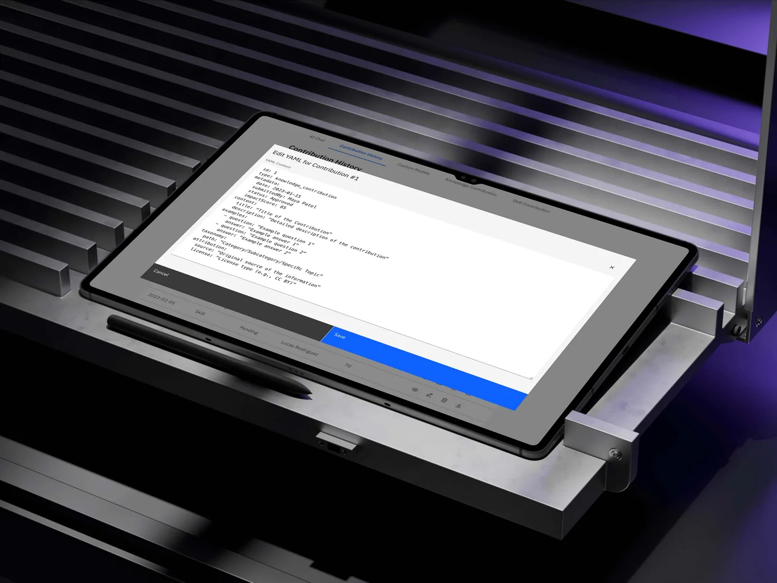
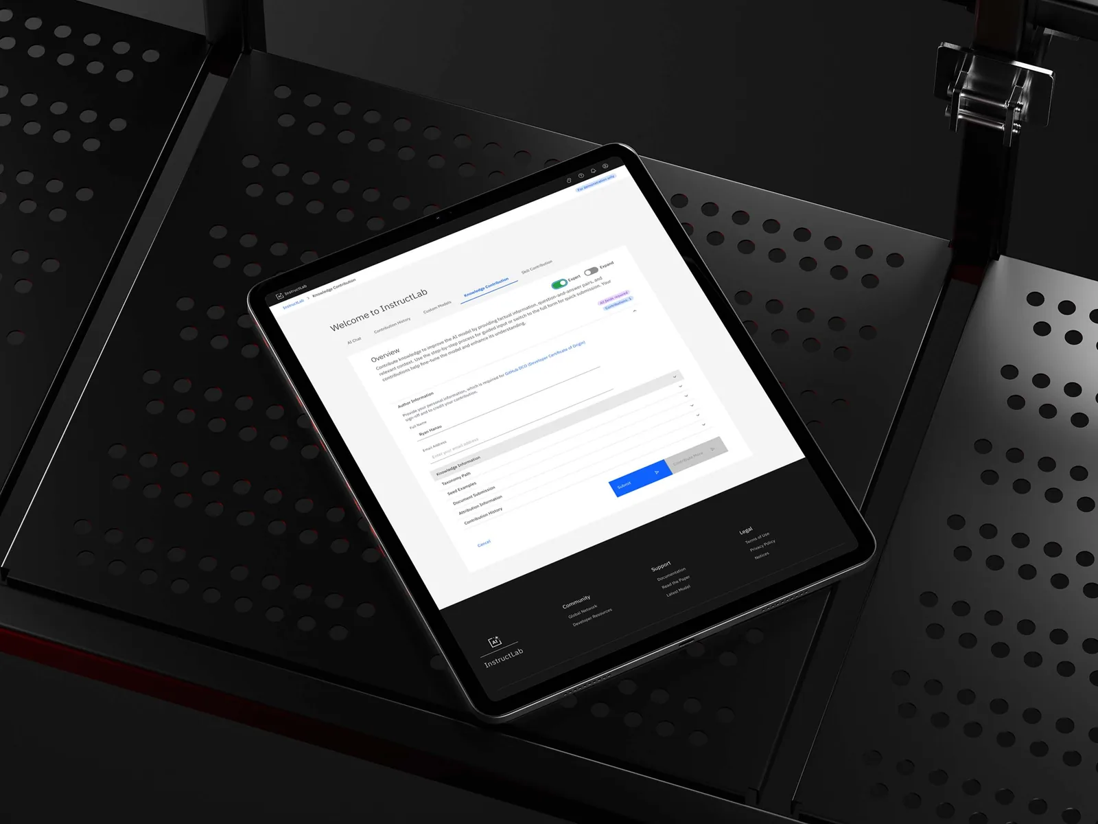
The same interface, framed on tablet, since a concept should look plausible somewhere other than a browser tab.
Design system
I built on IBM's Carbon Design System rather than inventing a new visual language, since consistency with InstructLab's real product is part of what makes the concept legible as a plausible next version rather than a fantasy redesign. Carbon's grid, its restrained color use, and its existing notification and progress patterns did most of the work. My job was choosing which of those patterns fit a contributor's anxiety at each step, not drawing new ones.
Where it stands
This is a concept exploration, built ahead of a live deployment.
The targets
Adoption, redirect accuracy, time saved
These are the three measures I set as bars for a simulated walkthrough of Patricia's scenario.
The caveat
Simulated, not measured
The walkthrough was mine to run, so these are targets for a future study, not results from real use.
What I learned
Designing against a persona's anxiety, not just her tasks, produced the interesting decisions here. Redesigning someone else's shipped product also taught me something about constraints.
The method
Ask what erodes trust, then remove it
The progress states, the guardrail screen, and the confidence signals all came from asking what would make Patricia trust the system less.
The real constraint
Not the interaction pattern
The constraint that mattered most wasn't any single interaction pattern I designed.
Staying inside Carbon
Still InstructLab, not a different product
The result had to stay inside Carbon closely enough to still look like InstructLab, not a different product wearing its name.
This tree is the taxonomy every contribution travels into: broad domains branching down through subcategories into the specific skills and knowledge nodes a submission actually attaches to.