The problem
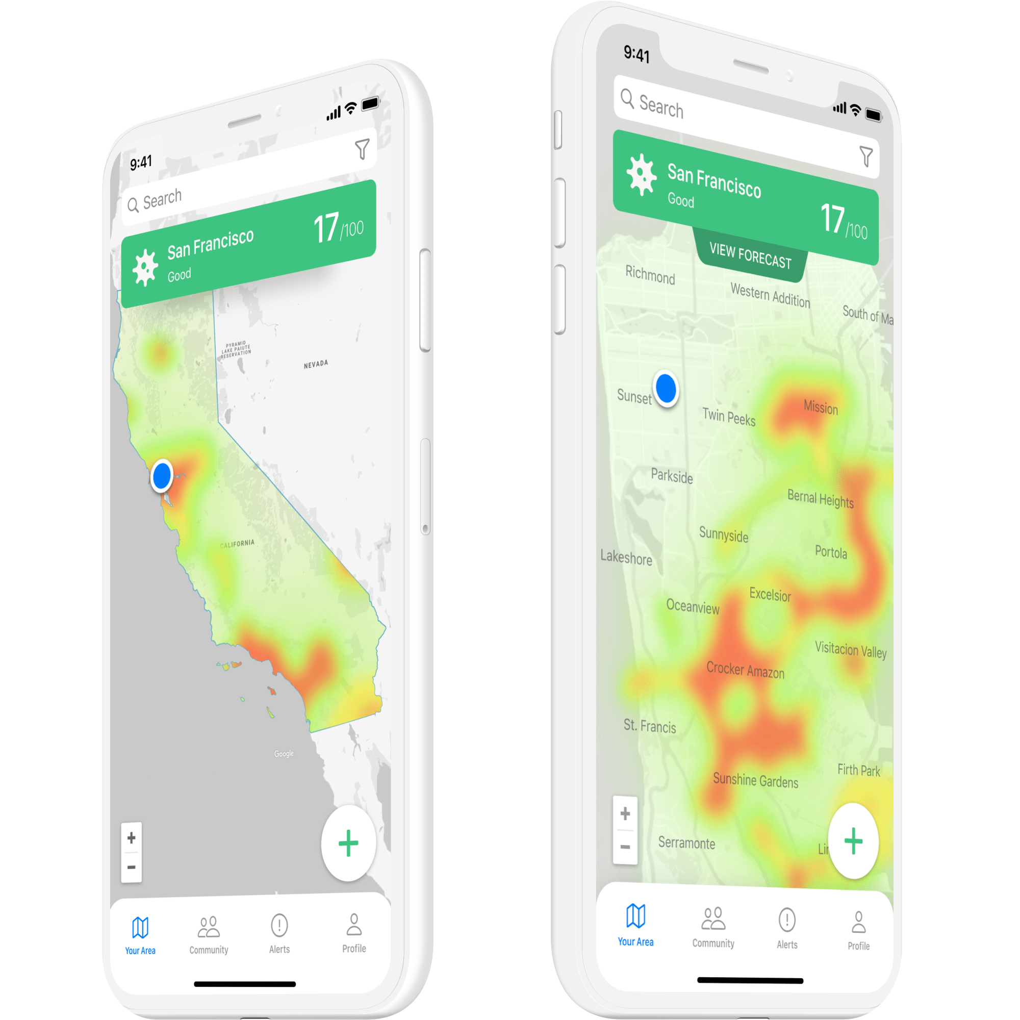
The idea sits inside a real enterprise tension. Field employees need timely, location-specific risk context. Employers need to provide it without turning duty of care into surveillance. I designed against both halves of that at once, for two devices with two different jobs: the phone carries the complete operating picture, and the Watch reduces that picture to a glance, a warning, or one action.
Research
There's no live data source behind this concept, so the design work is really a research plan: a set of principles for what any real risk feed would owe a user before it could be trusted, and a set of targets for what I'd want to test once this moves past static screens. I reframed the usual product-metrics template as open questions rather than assumed wins.
- Evidence with provenance: a statistic needs a documented refresh interval, jurisdiction, confidence level, and a visible failure state before it can carry a safety decision.
- Progressive disclosure mapping: what belongs on the phone versus what belongs on a two-inch screen, ranked by how much time a person has to look at it.
- Proposed validation targets: activation, alert response, task success, and trust, defined for future testing.
Design decisions
The phone and the Watch don't show the same screen at two sizes. They show two different edits of the same information, chosen by how much attention a person can spend. On the phone, someone can scan conditions, open a warning, inspect the evidence behind it, control which layers they see, and coordinate an evacuation: five levels of engagement in sequence. On the Watch, the same hierarchy compresses to one glance, one warning, and one action, with the crown available for anyone who wants to drill down anyway.
Risk itself needed its own language. A four-level index (good, moderate, high risk, critical) ties a color to a label, a number, an icon, and a specific set of available actions, so the meaning survives a glance, colorblindness, or a bad screen in direct sun.
Two devices
Comprehensive on the phone, decisive on the wrist
The phone carries the full operating picture. The Watch reduces that picture to a glance, a warning, or one immediate action.
Risk language
Four levels, never color alone
Color, an explicit label, a number, and an icon move together as risk rises, so urgency reads the same way to everyone.
Privacy
Sharing as a temporary action
Location and status are opt-in, audience-specific, and reversible: a deliberate safety action, not a default state of being watched.
Evidence
No statistic without its source
Every number needs a documented freshness, geography, and failure state before it earns a place in a safety decision.
Color is a redundant signal alongside explicit labels, numeric values, icons, and instructions.
Risk language
Good
0–50
Calm status and normal operations.
Moderate
51–75
Heightened attention without alarm.
High risk
76–99
Urgent warning and direct action.
Critical
100
Evacuation and emergency coordination.
From ambient awareness to coordinated evacuation
Five levels of engagement, from a scan of local conditions to a coordinated evacuation.
A contextual warning interrupts the map when someone approaches a high-risk zone.
The Apple Watch
The same architecture, reduced to what's needed at a glance, with the crown for anyone who wants more.
Runs in the phone frame at the top of this case.
Where it stands
Everything here is a static design exploration, built ahead of any live system, and the next step isn't a feature at all.
Status
Scope
This case covers the design exploration; a live feed, a pilot, and a production build are the next phase.
Trust
Validate before shipping a feature
The next step is validating trust and failure comprehension, not adding another screen.
Access
Accessibility and consent, tested first
Accessibility conformance and employee consent need testing before anyone asks whether the interface is likeable.
What I learned
The privacy model was the hard part, not the map. I ended up treating sharing as a verb with a duration, not a setting with two states, and that decision drove more of the interface than the risk scale did.
The hard part
Consent, not the heat map
It's easy to design a heat map. It's harder to design exactly when one colleague becomes visible to another, and to make that reversible.
The decision
Sharing as a verb, not a state
Treating sharing as a duration rather than an on or off setting shaped the opt-in language, the crisis-chat scoping, and the Watch's status control.
The takeaway
Consent needs the same care as color
Color communicates urgency at a glance. Consent has to be designed with just as much care, not left as a toggle.