The problem
I'd spent years designing e-commerce for retailers, including Audi, Louis Vuitton, and Toyota, and kept running into the same gap. Someone sees an item they want: on a friend, in a photo, on the street. They have no way to search for it except typing words at a box that doesn't understand "that jacket, but not exactly that jacket." Low confidence in fit and style is also a major driver of returns, and text search does nothing to close that gap either.
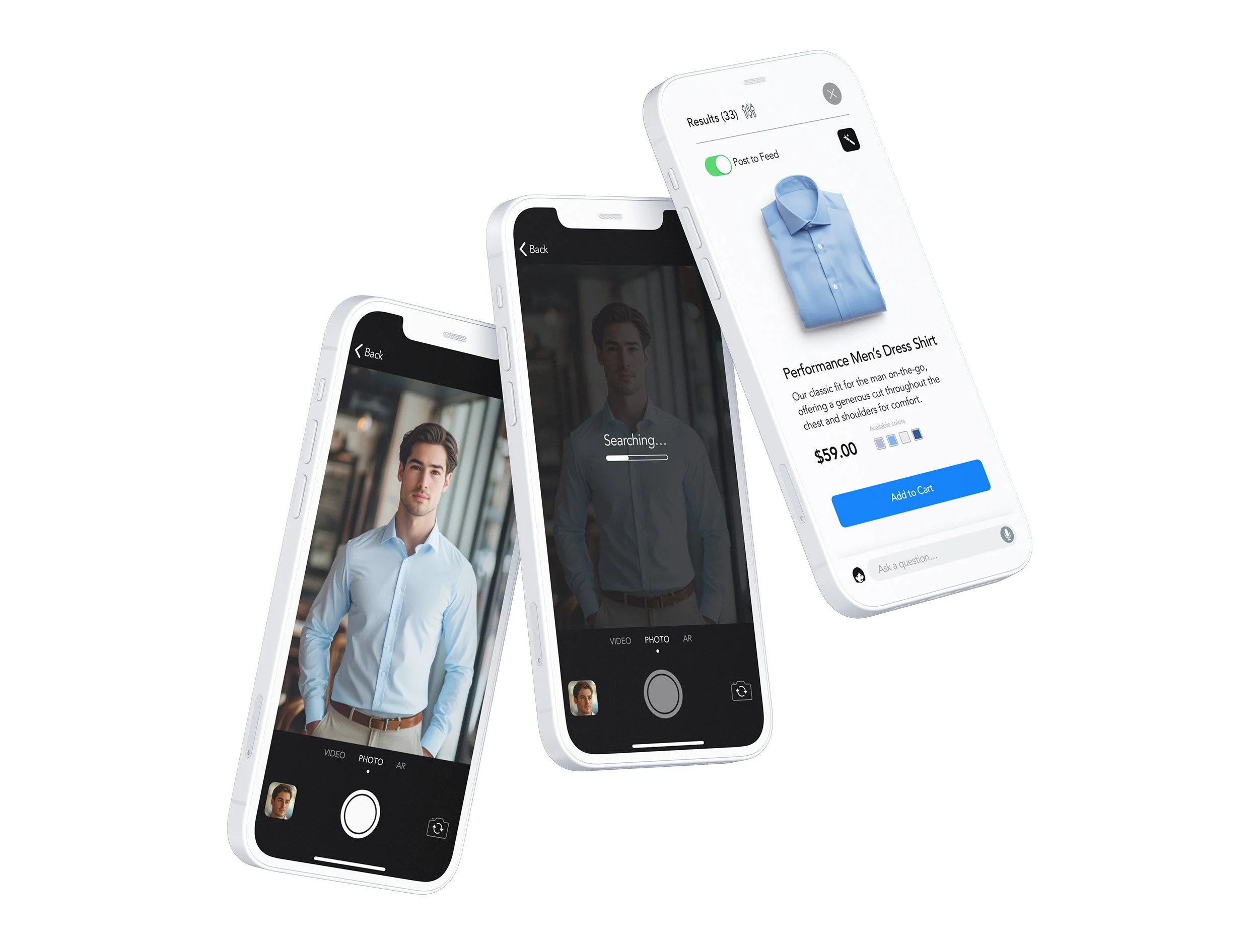
Retailor started as my answer: search by photo first, then let a social layer and AR try-on solve the two problems that show up right after you find the item, whether you trust the match, and whether you'd actually keep it.
AR try-on
Research
Before designing anything, I audited today's typical fashion-shopping experience against a custom 25-criteria scorecard I'd built at Saatchi & Saatchi, scored from minus two to plus two and judged through a persona lens: a style enthusiast who screenshots looks and wants the exact item, in the right size, with social proof. The failing scores clustered in exactly three places, visual search, fit confidence, and trusted social discovery, which became Retailor's three AI bets. I benchmarked the concept the same way, scoring five incumbents, ASOS, Amazon Fashion, Pinterest, Instagram Shop, and Zalando, on a one-to-five scale across those same axes. The category clustered around a mediocre baseline. Nobody combined accurate visual search with try-on confidence and trusted discovery.
- A heuristic audit: 25 criteria, scored minus two to plus two, applied to today's fashion-shopping apps through a single persona's eyes.
- Competitive benchmarking: five incumbents scored one to five, median not mean, across the axes Retailor targets.
- A six-session moderated usability study on a real coded prototype, five tasks per session, think-aloud throughout.
Design decisions
The experience
I built the prototype as real code, not a click-through, specifically so I could run a study on it and ship fixes between sessions instead of writing them down for later. Six moderated sessions, five tasks each, fifty-five changes shipped live in real time. The fix count per session (12, 9, 6, 3, then a jump to 14, settling to 11) tells an honest story: the design converged through the fourth participant, then two later sessions, a power user, then a plus-size in-person shopper, surfaced fresh problems worth twenty-five more fixes between them.
Photo search
Ship the core loop alone first
Photo search launched with no social feed and no AR, because a shopper has to trust the match before anything built on top of it is worth having.
The prioritization call
Protect the weak link, don't hide it
AR try-on is the feature everyone finds most exciting in a demo and was the hardest task in the study: one success out of six attempts. It stays the hook in every pitch, but ships last, behind its own gate, never on the path to search or checkout.
Scope
A feed with nothing proven stays switched off
The social network doesn't turn on until saved looks show people actually revisiting them. A feed nobody returns to is a moderation cost, not a feature.
Assistant
Scoped to the match, not general-purpose
A general shopping assistant got cut in favor of one scoped to sizing, materials, and care for the item just found, because that's what the study's standout moment was actually about.
Mobile designs
Oh wow. It's amazing. More efficient than going to reviews.
Study participant P03, on the AI assistant
Where it stands
Retailor is a product built ahead of its first customer, so I set the roadmap as four gates instead of four dates, each one dependent on the gate before it: if search quality stalls, everything downstream pauses, because every later feature assumes the match underneath it is right.
Gate one
Search earns a repeat visit
Searchers come back for search alone, unprompted, before phase one counts as proven.
Gate two
Saved looks get revisited
The social layer turns on only once saved looks show people actually returning to them.
Gate three
AR moves confidence, not just delight
An AR pilot has to move buying confidence itself, not just impress people in a demo, before it earns its place.
What I learned
The study's headline number wasn't the one I liked best, and that was the useful part. Photo search hit five for five with a task-ease score of 4.8 out of 5. AR try-on, the feature everyone finds most exciting in a demo, was the hardest task in the study.
The choice
Build around the weak link, don't hide it
I could quietly de-emphasize AR in the materials, or build the roadmap around the fact that my most exciting feature was also my least proven one. I chose the second option.
The principle
Follow the reliable result
When a study's flashiest result and its most reliable one point in different directions, the roadmap should follow the reliable one.
The discipline
Say so plainly
State that plainly rather than let a good-looking pitch imply otherwise.